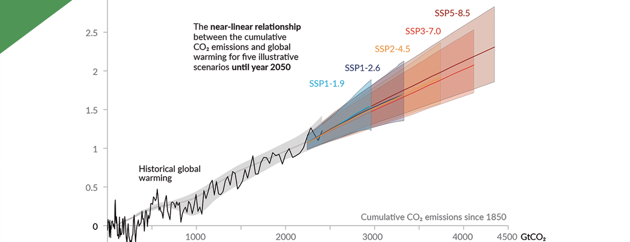
Near-linear relationship between cumulative CO2 emissions and the increase in global surface temperature.
A bridge to understanding climate is understanding the data that is at its core. Today, scientists rely on the smallest measurements of temperatures, ocean currents, soil moisture, air quality, cloud cover, and hundreds of other phenomena on Earth and in its atmosphere, creating a deluge of data.
The data is also critical to help the public understand the climate crisis. The 2021 IPCC report marked a departure from previous climate communications as the report authors, with the support of the Tyndall Centre and InfoDesignLab, instigated a new co-design process that generated a new style of imagery that received accolades from the design industries. By utilizing a co-design process facilitated by InfoDesignLab, members of the IPCC in collaboration with researchers from the Tyndall Centre were able to craft effective branding for the 2021 report Climate Change 2021: The Physical Science Basis, which served as a basis for many conversations at COP26.
Noemi Florea has compiled some key data visualizations from 2021 for the Global Observatory that highlight progress on climate change, from expanded research on the global environment to emerging developments for climate adaptation.
Rising Temperatures in Europe
A detailed visualization of the distribution of rising heat levels across Europe was published by the European Data Journalism Network this year. The map pinpoints precise changes in average annual temperatures in towns across Europe, categorizing temperature rises between below 1.5 degrees Celsius, 1.5-2.5 degrees Celsius, and more than 2.5 degrees Celsius. The precision and depth of data provide both a macro-scale perspective on the regional impacts of climate change across Europe, while also enforcing a greater sense of awareness at the highly localized level.
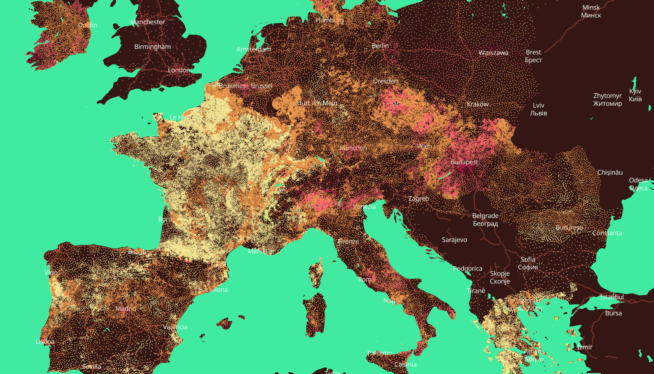
Temperature increases below 1.5 degrees (yellow), 1.5-2.5 degrees (orange), and more than 2.5 degrees (pink) across Europe. Credit: European Data Journalism Network. (Click to enlarge)
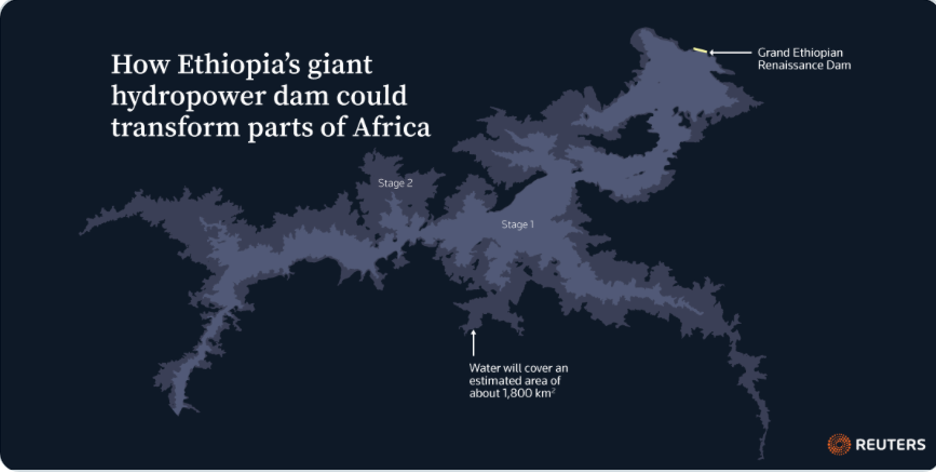
Hydroelectricity in Ethiopia
An upcoming hydroelectric dam in Ethiopia stands to provide both benefits and drawbacks to the local population by providing electricity to a largely underpowered region while potentially impacting water accessibility for certain populations by reducing the Nile river’s flow. In July, Reuters analyzed United Nations data along with satellite imagery to project what the dam’s impacts could be across Ethiopia and the rest of the African continent.
National Commitments to Greenhouse Gas Emissions
In July, #TheSDGVizProject partnered with Tableau to host the global data visualization challenge #Viz4ClimateAction, after Salesforce announced it would be a partner sponsor at the 26th UN Conference of the Parties, held in Glasgow this November. Data visualization consultant Arshad Ejaz created this visualization as part of the challenge to map out the global change in greenhouse gas emissions from 1998 to 2018. The core cylindrical graph orders countries by their percentage in national reductions or gains in greenhouse gas emissions each year, and sizes their graphical representation accordingly.
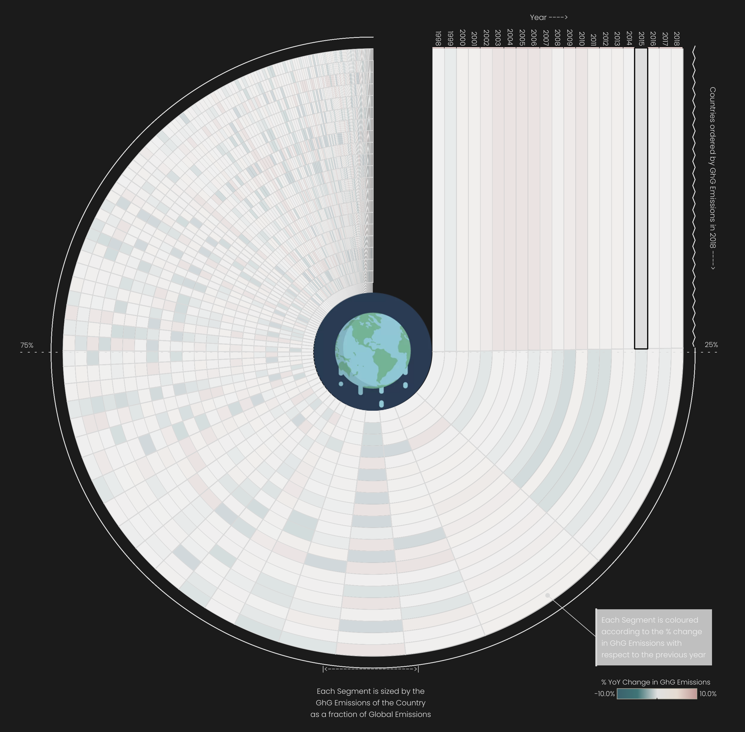
Post the Paris Agreement, GHG emissions appear to be slowly decreasing for most signatories, and emissions are increasing at a slower rate for developing populous regions. Credit: Arshad Ejaz. (Click to enlarge)
Climate Impacts in Western Germany
The regional impacts of climate change came to light in 2021 with record-high temperatures, greater rainfalls, wildfires, and flooding. In July, the German newspaper Süddeutsche Zeitung launched a data visualization of changing rates in the country’s precipitation, heat, and soil moisture over the course of decades. The three graphics highlight the country’s regions that may be especially vulnerable to global shifts in climate patterns. In September, data visualizations mapping the impact of Hurricane Ida in the United States also highlighted cases of vulnerability to rising sea levels.
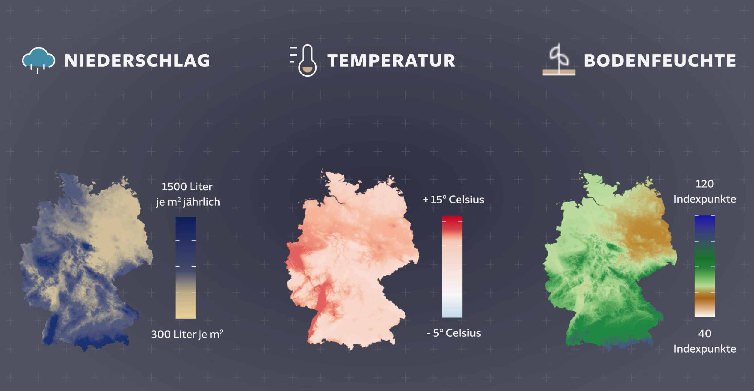
Changes in precipitation (1981-2010); heat (1981-2010); and soil moisture (1991-2020) in Western Germany. Credit: Süddeutsche Zeitung. (Click to enlarge)
Human-Driven Climate Change
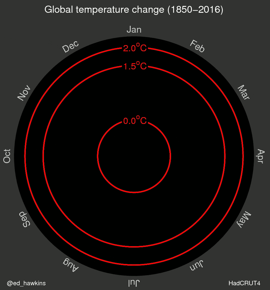
Ed Hawkins, a climate scientist and a lead author for the 2021 IPCC report, known for designing data visualizations such as the spiral chart of global temperature changes and the #ShowYourStripes temperature stripes, created a new visualization for the “Hockey Stick,” highlighting where man-made or anthropocentric warming deviates from natural global warming cycles. The graphic underscores the industrial nature of global climate change today and negates some circulating claims that contemporary global warming is a feature of the earth’s natural warming cycles.
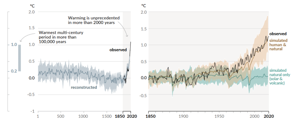
Changes in global surface temperature relative to 1850-1900. Credit: IPCC Sixth Assessment Report. (Click to enlarge)
International Impacts
Unifying international commitments for climate change mitigation has been one of the most pressing topics of 2021. This data visualization designed by Saverio Rocchetti for #Viz4ClimateAction compares the impact of rising temperatures with changes in greenhouse gas emissions between both continents and hemispheres.
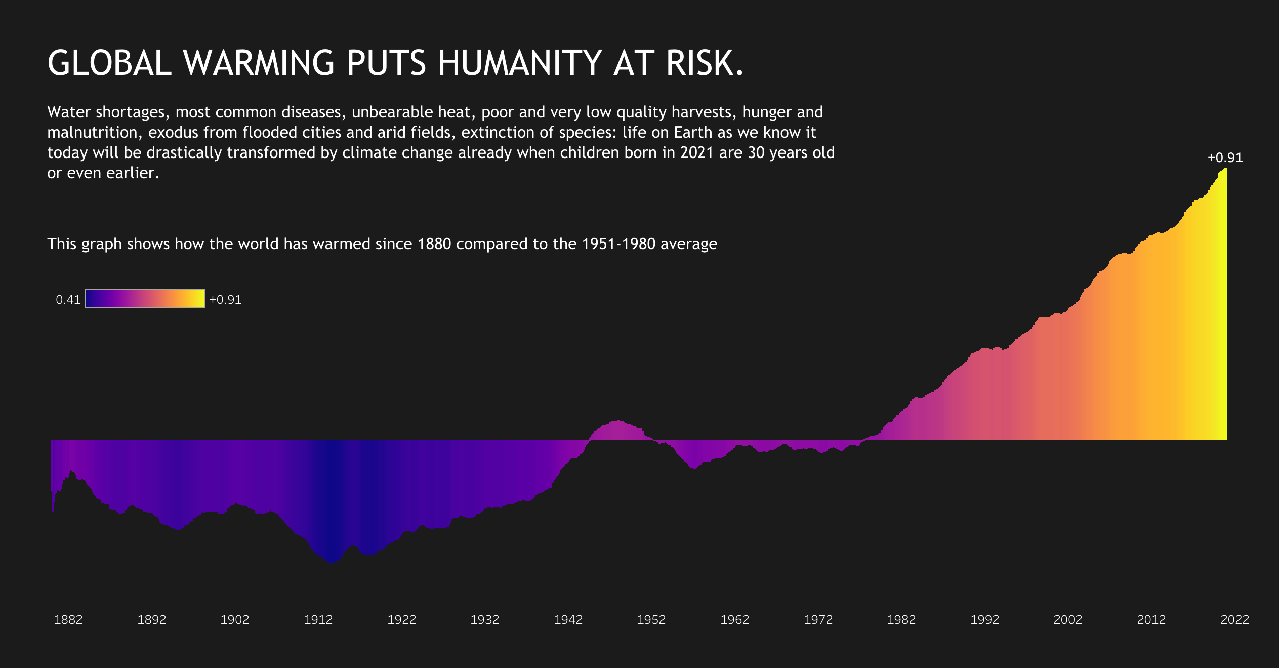
The world has warmed since 1980 compared to the 1951-1980 average. Credit: Saverio Rocchetti. (Click to enlarge)
An Emissions Frame of Reference
Seeing C02 by design studio Extraordinary Facility is an interactive data visualization that compares proportions of CO2 emissions to natural and architectural structures in the world. Players can explore the visualization by navigating in a car, collecting information points that reveal points of information about climate change and greenhouse gas emissions. From a double-decker bus to Mount Everest, carbon dioxide emissions take on a new frame of reference in this dynamic layout.
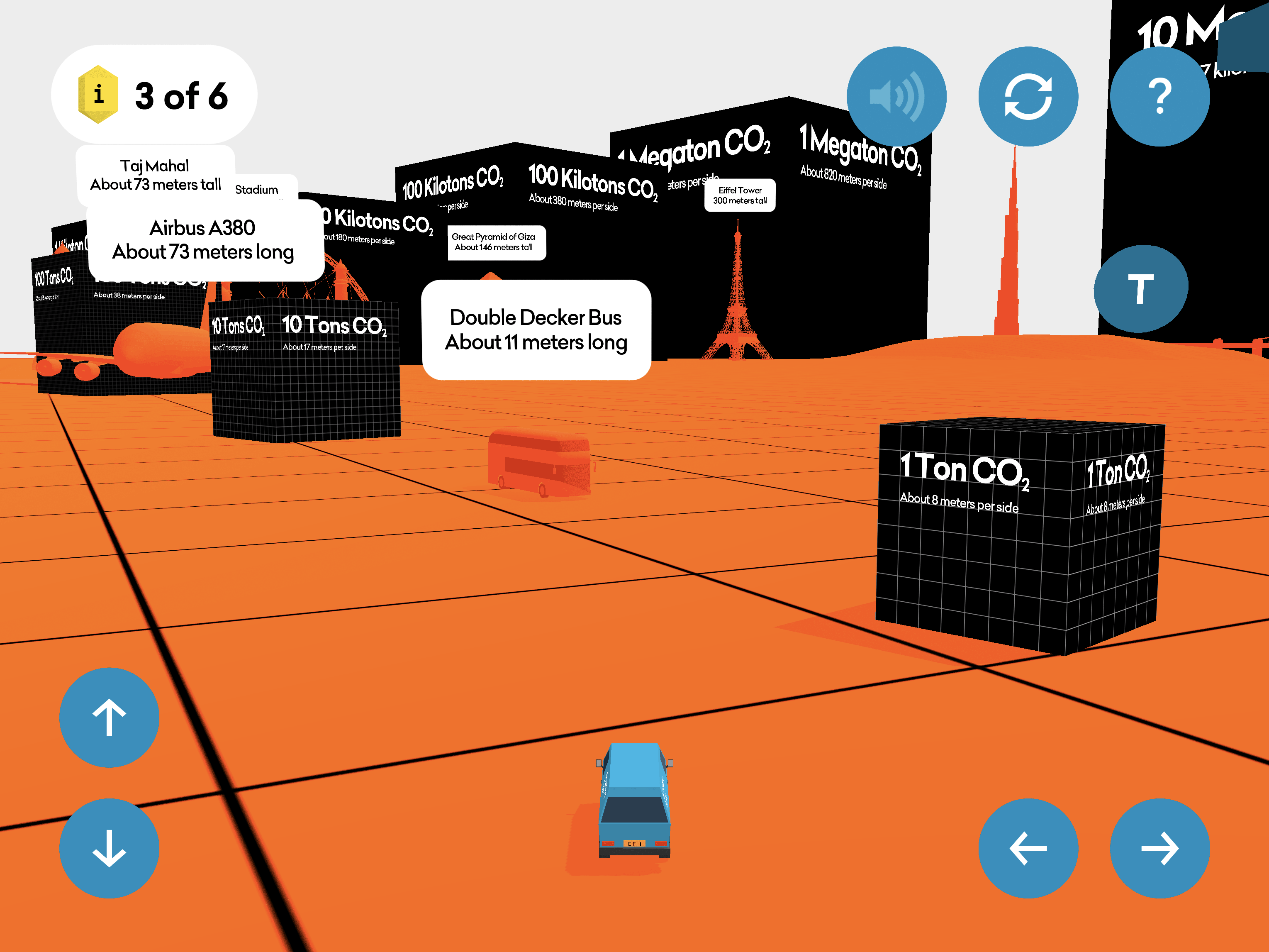
Proportions of Co2 compared to objects, global monuments, and sites in the playable dataviz Seeing Co2. Credit: Extraordinary Facility. (Click to enlarge)
This article is part of a series reflecting on global climate action in the wake of COP26.
Visit our “New Data Visualizations, 2023” article.
Noemi Florea is Intern in the sustainable development program at the International Peace Institute.