The atmosphere. Credit: NASA
The blue light of the sky is a view of the atmosphere, a stretch of gases unique to Earth and tethered to the planet by gravity. It now holds levels of planet-warming gases like carbon dioxide not seen in three million years.
The COP28 conference in Dubai ended this week with some successes and a pledge from countries to reign in these invisible emissions—a strong pitch meant to build momentum for a faster energy transition, as the warmest year in recorded history comes to an end.
Scientists have been collecting data about the climate since at least the early 19th century. Data visualizations, however, are a relatively new phenomenon, and have become an important way to understand the climate crisis.
Here are some notable ones from 2023.
Who Produces the Most CO2, And Who Bears the Impacts?
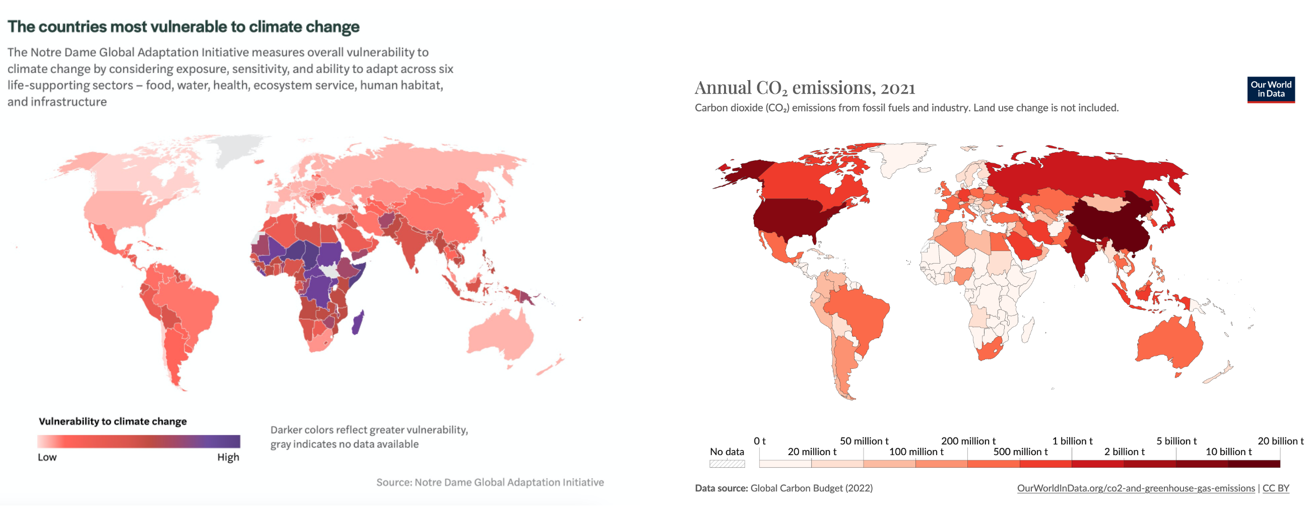 Side-by-side, these two maps illustrate the misalignment between countries that will suffer the brunt of climate impacts (left), and those emitting the most CO2 (right). A lot of work went into a success at this year’s COP28 in making a Loss and Damage fund operational to address this, though initial pledges have been modest so far.
Amazon Deforestation Hits a Five-Year Low
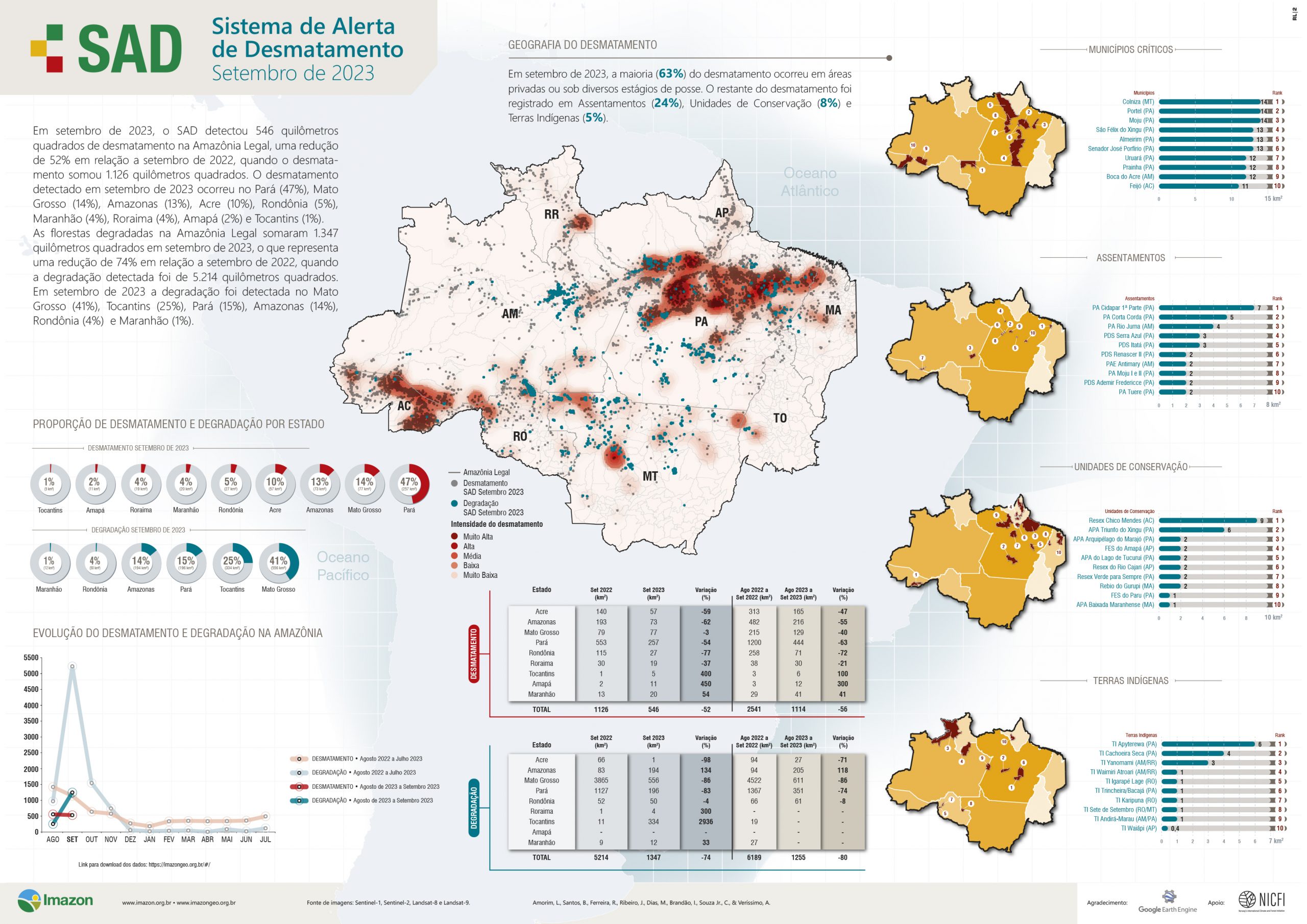
The environmental non-profit Imazon is using satellite data and artificial intelligence to track and stem the deforestation and degradation of the Amazon.Source: Imazon
Some good news from the worlds’s largest rainforest, which hit its lowest level of deforestation in five years, thanks to the work of activists and the election of President Luiz Inácio Lula da Silva, who took office in January. Even more good news on forests came earlier this month: research shows that over the past 20 years, protected areas around the world have helped stop deforestation and kept as much as a year’s worth of fossil fuel emissions from being released into the atmosphere.
The scale of deforestation has driven local and global environmental movements to work to protect it, including efforts to make its destruction an international crime of ecocide. Over the past two years, Indigenous defenders of the Amazon have been murdered, including Orlando Possuelo and Bruno Pereira.
Fossil Fuels Are the Problem
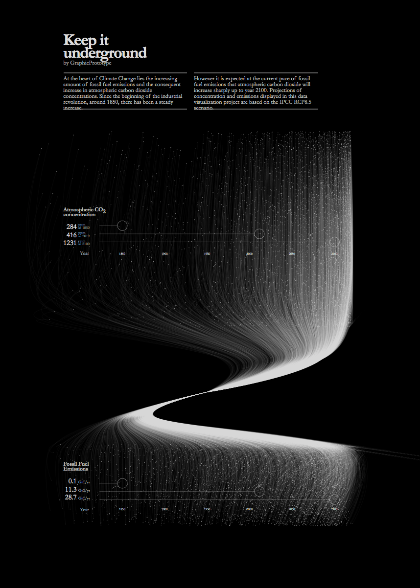 The graphic by Graphic Prototype starkly illustrates the connection between burning fossil fuels and the amount of CO2 in the atmosphere. As the illustration suggests, twisting the data does not change the result: fossil fuels still account for over 90% of global CO2 emissions.
US Fossil CO2 Emissions Dropping, but Still Most Per Capita
This graph from Robbie Andrew at Cicero shows some overall success the United States has had in reducing its reliance on fossil fuels, but, as the biggest per capita emitter, it still has a ways to go in the energy transition.

A Year That Surprised Scientists
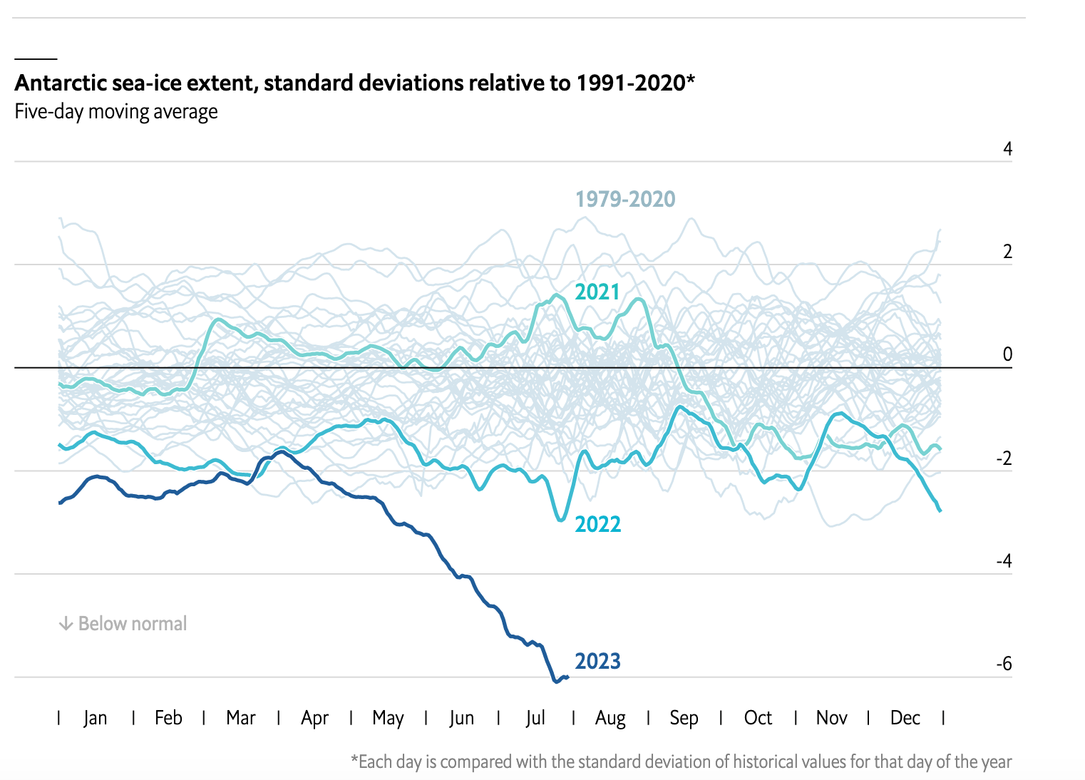 The chart at right shows one of the most startling surprises of the year—an unprecedented drop in the level of Antarctic sea ice. Scientists described this as a “very sudden change” and “very, very concerning.”
September brought numerous anomalous events, including catastrophic flooding in Libya and Brazil. The record for the hottest September was broken by .5 degrees C, a “staggeringly large margin.”
2023 itself was the warmest year on Earth since instrument records of temperature began 174 years ago.
It’s Not Just Energy: Reducing Emissions in the Food System
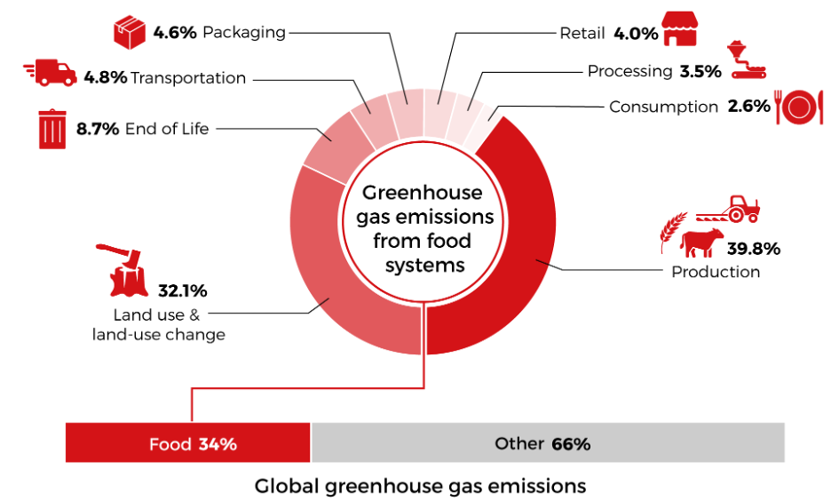 This year’s COP28 brought attention to the global food system, which accounts for one-third of human-caused greenhouse gas emissions like CO2 and methane. As the graphic shows, land use and land-use changes, as well as the production of food, account for the bulk of food system emissions. Stakeholders are working to raise the ambition on this as a way to reduce overall global emissions to keep to a 1.5 pathway. One challenge is how to do it quickly without affecting food production.
Attribution Science: How Much Does Climate Change Supercharge Extreme Weather?
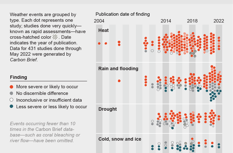 According to a new study published last week, the extreme rain and flooding in Ethiopia, Kenya and Somalia this fall was made twice as intense by climate change. This piece of data has historically been missing from the climate puzzle: how much of any one particular extreme climate event was due to human-caused warming? Using climate models, scientists can now show to what degree any climate event would be likely to happen because of climate change. Carbon Brief has developed a dashboard where users can see the degrees in which climate change supercharged events.
The IPCC Sixth Assessment Synthesis Report
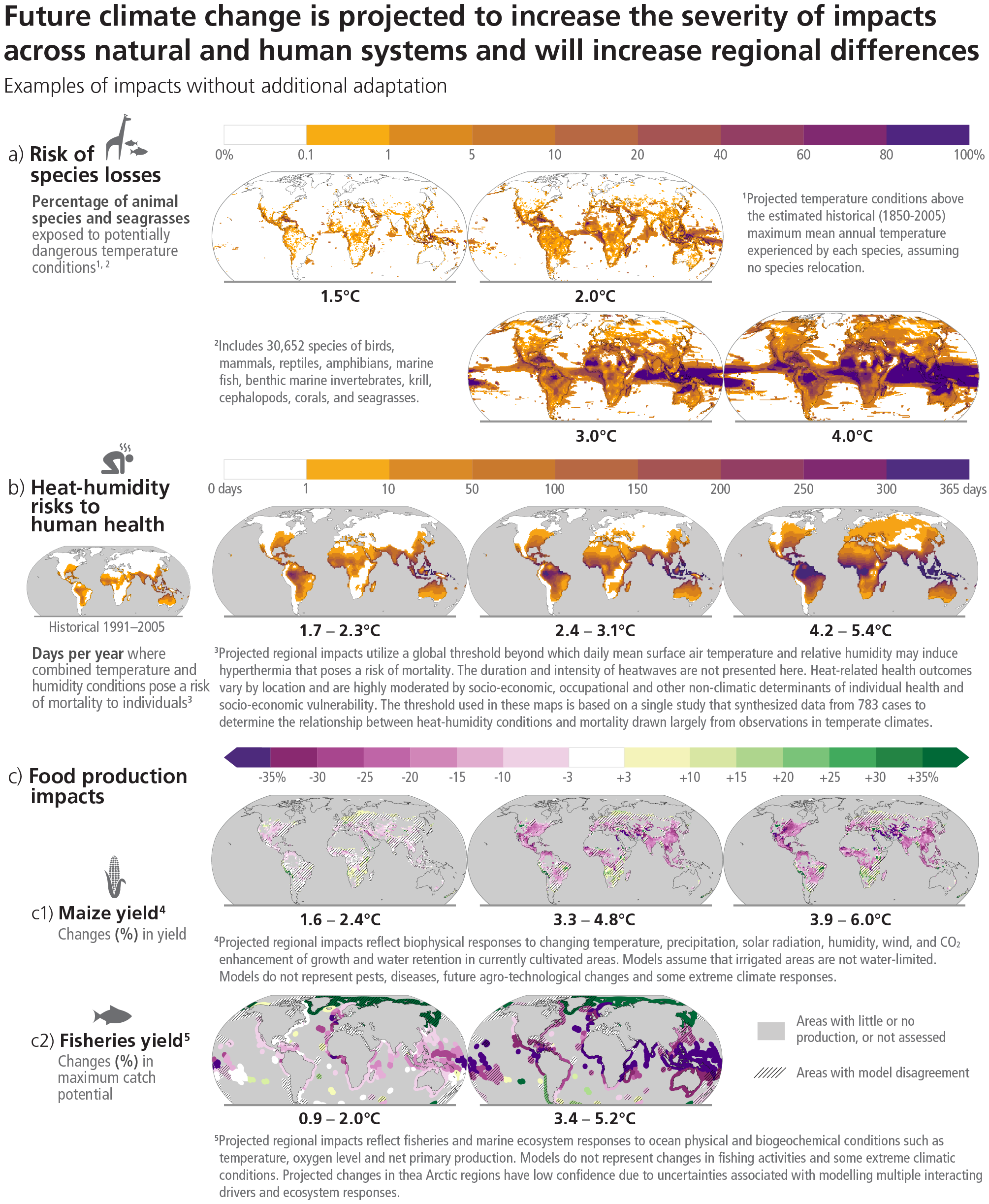
From the IPCC Working Group I Sixth Assessment
Every few years, the Intergovernmental Panel on Climate Change releases a series of assessment reports, co-written by groups of climate scientists, covering what is known about climate change. The resulting visualizations from the March 2023 AR6 Synthesis Report illustrate how higher global temperature averages increase the negative impacts on various natural and human systems.
In US, Solar and Wind Take Off, Cost of Renewables Plummets
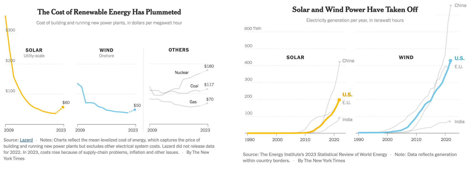 A bit of good news from the second-largest emitter of CO2, the United States, which needs to move fast on transitioning away from fossil fuels. Thanks to government incentives and the culmination of small and large scale projects over the years, the country saw a big jump in renewables and a plunge in costs in recent years. But there is still a lot to be done, including with the electrical grid.
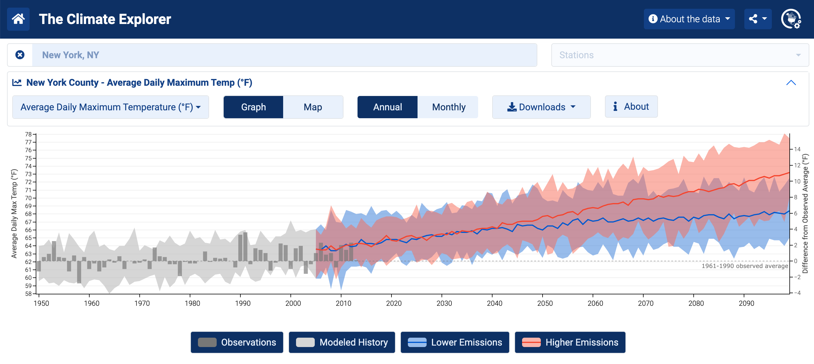
Climate Futures for Where You Live
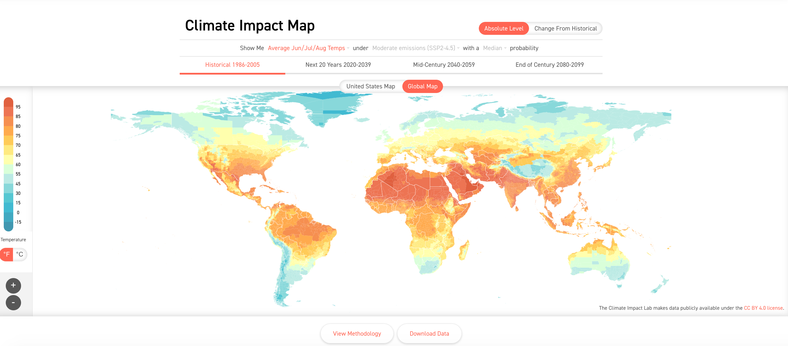
The Climate Impact Map
More data than ever is available about how climate change will impact every corner of the world. While not new this year, it is interesting to see the growing number of dashboards—some global, some from national space agencies—which now allow the public to examine how different emissions pathways affect, and will affect, where they live. Both the Climate Impact Map and the Climate Explorer launched last year.