The Global Observatory has collated a few of the most creative, useful, and powerful visualizations from 2017 that shed further light on a global issue or that challenge preconceptions.
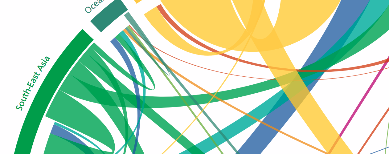
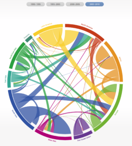
The Global Flow of People
In recent years, migration from the Middle East and Africa to Europe has preoccupied world leaders and highlighted some entrenched faulty narratives that persist in policymaking but do not correlate with research. Significant population shifts are also occurring in other regions, and internally displaced persons remain a big humanitarian challenge.
This interactive tool by Nikola Sander, Guy J. Abel, and Ramon Bauer captures the complexity of global migration flows by visualizing the number of people moving between and within regions from 1990 and 2010. The estimated flows are based on the number of people who changed their country of residence over five-year periods. The data used for the visualization is also available.
Temperature Anomalies Since 1900
Illustrating the rise in global temperatures has historically been the role of the “hockey stick” graph or two-dimensional maps. In August 2017, Antti Lipponen created this stunning evolution that was shared widely on social media.
Temperature anomalies arranged by country 1900 – 2016 ?. #dataviz #climate #climatechange #globalwarming Download ?: https://t.co/JnaU0tKDlc pic.twitter.com/w3yjmddpOe
— Antti Lipponen (@anttilip) August 1, 2017
Deaths from Terrorism
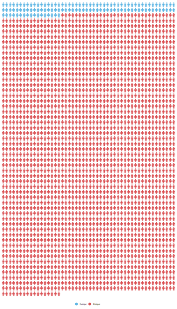
Media coverage of terrorist attacks is dominated by those occurring in Western countries, whether in Europe or North America. The reality, however, is that the vast majority of deaths attributed to terrorism are in other parts of the world. In October 2017, Radio Télévision Suisse (RTS) published this infographic comparing the number of deaths from terrorism in Europe and Africa. According to their research, at least 2,600 people were killed in terrorist incidents in Africa between January 1 and October 25. In the same time period, 117 people were killed in Europe.
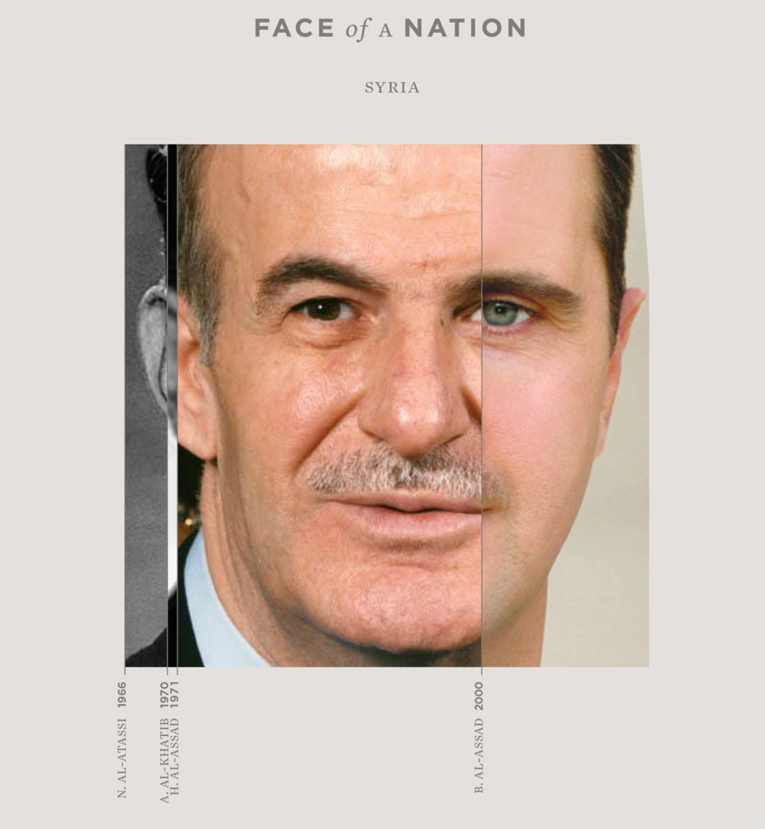
Face of a Nation
Artist Güney Soykan took a novel approach to visualizing the political history of a nation. His series, “Face of a Nation,” uses portions of leader’s faces from select countries to mark the duration of their power, and the composite is used to create one face for a nation. This captures at once the form of government, rivalries, the dominance of parties or individuals, and the lack of gender balance and diversity.
Rivalry Between Iran and Saudi Arabia
The rivalry between Iran and Saudi Arabia was a top news story in 2017 due to its significant implications for the conflicts in Syria and Yemen, yet the complexity of the situation has been a challenge to describe for even the best information outlets. This infographic by Agence France Presse displays the regional rivalry between the two countries, their allies, and the groups and leaders they are supporting across the Middle East.
Saudi-Iranian rivalries in the Middle East pic.twitter.com/dOsKz58O51
— AFP news agency (@AFP) December 19, 2017
Political Map of Mali
In 2012, with militants from the north of Mali moving south after an armed conflict broke out, the interim Mali government found itself on the receiving end of military assistance from France in the form of Opération Serval. A United Nations stabilization mission was established in April 2013; however, almost five years later, a peace agreement is still elusive.
This infographic from June 2017 shows the flashpoints and international military operations in the country. It was published by the International Peace Institute, in an issue brief on lessons from the Inter-Malian agreement and challenges to its implementation.

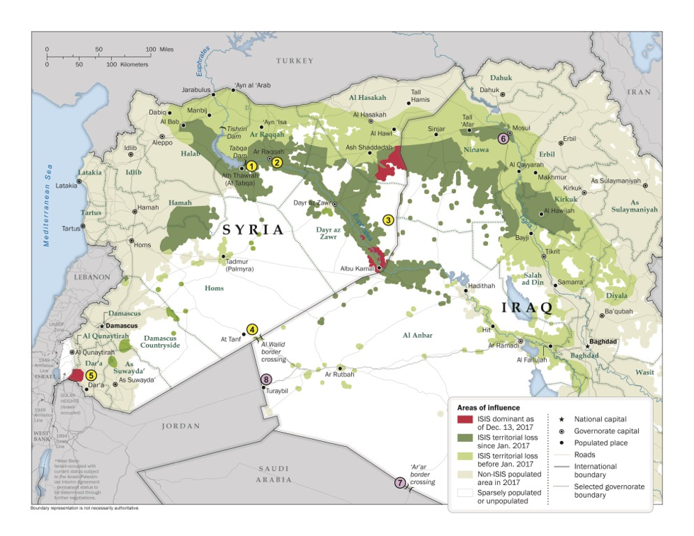
ISIS Territory Shrinks
Since the beginning of the conflict in Syria in 2011 and the rise of the so-called Islamic State (ISIS), the control of territory in Iraq and Syria has shifted markedly in favor of many groups. In 2017, the territory controlled by ISIS was drastically reduced to the extent that victory was declared over the group in Iraq. The below infographics by Syrian Digital Media and the US State Department show the change in fortune for ISIS in 2017 in both Syria and Iraq.
Control map in Syria 2017 vs 2018
Designed by @MaximMansour #SAA #ISIS #SDF #HTS pic.twitter.com/6vXOYHYRf4— Syrian Digital Media (@SyriaDM) January 1, 2018